Establishing the Problem
Decoding the courses a college student must complete to graduate is challenging. In addition to university requirements, each program has its own course plan that students need to navigate and track. With student debt at an all-time high, taking the right courses in the right order can be what saves a student from spending an extra semester or even an extra full year in college. With the average cost of 1-year of tuition at a state school for an in-state resident being close to $10,000, the mistake of not taking the right courses can be very costly.
Being an Assistant Professor at Temple University, Tyler School of Art and Architecture I see this first hand. Students often want to take control of their studies and plan out their years in school, but the current digital tracking systems are archaic. Our advisors do an amazing job helping our students navigate this, but often the students lack follow through when it comes to following the advising plan. While working with my colleagues on updating our program’s curriculum I also took a dive into creating an app for students to navigate our new curriculum.

User Flowchart
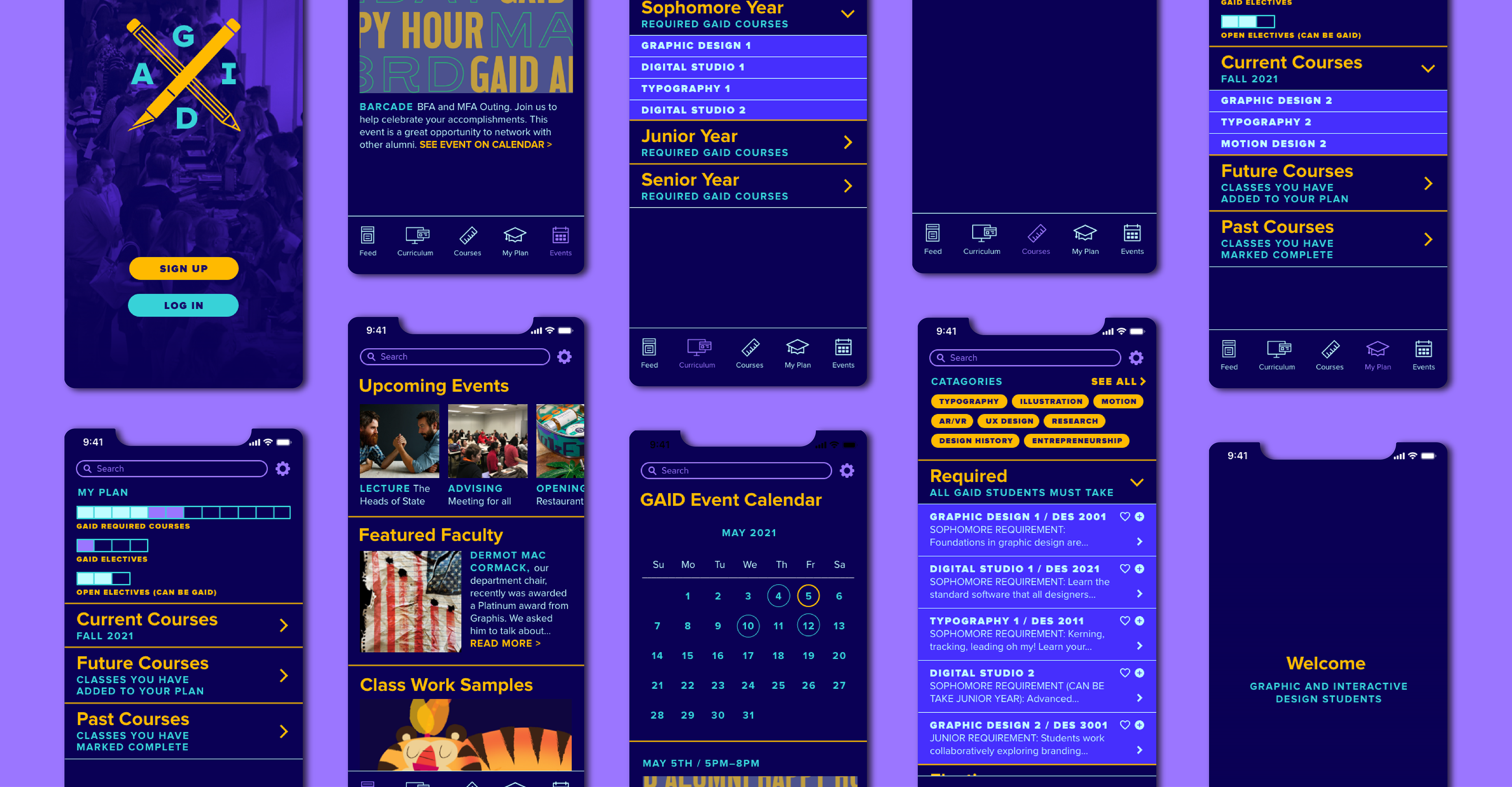
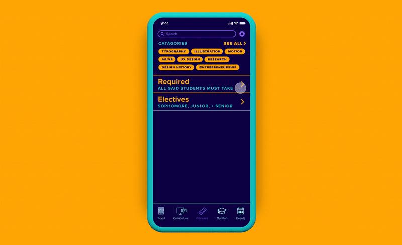
As I began to transfer my card sorting exercise from Padlet into Adobe XD I took time to consider how and when the user would encounter the information throughout my app. Knowing that the word “schedule” triggered Alex to think he could actually plan out his schedule led me to combine the “Course Information” and “Plan my Degree” sections. I also changed the “My Schedule” section to “My Plan” to ease the confusion. I realized a lot of the cards I had in my sorting exercise would be better information grouped together under other sections. A lot of this consolidation happened under the new “Courses” section. With some testing, it made more sense to make your plan, then add courses to this plan directly under the courses section. The course flow shows that most of the content in this app will live under the “Courses” section.

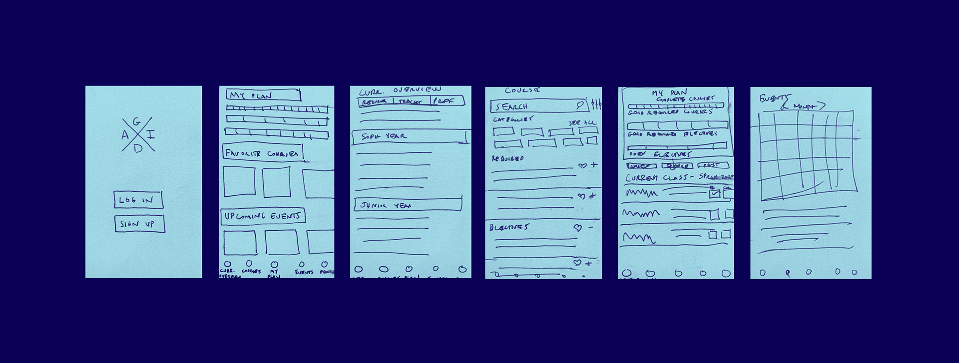
Paper Prototype and Wireframes
While the process to start the paper prototype was easier with the user flowchart I created, it was still a challenge to work through how to present all of the information that needs to be included. My first paper prototype focused on the landing page for each tab, with plans to dive deeper in the future. After I created the initial paper prototype, I had one of our students, who would be a user, test them out.
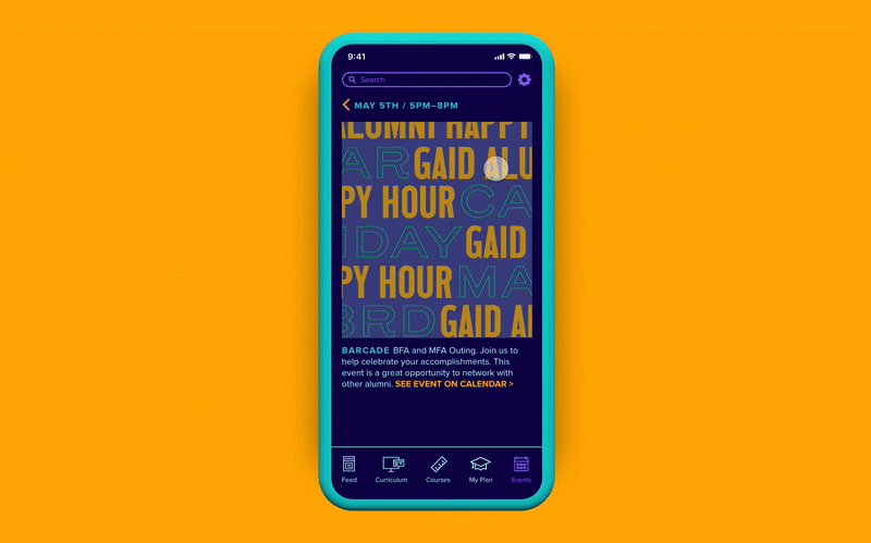
My user tester, Anisa Ambereen Chugthai, is a senior in our program. Since my paper prototype focused on the landing pages of each section our testing and conversation focused on the overall content and location of information. From the testing I was given two pieces of very valuable feedback: 1) Anisa thought the events tab provided valuable information and made the suggestion to lead with it when you first log in, 2) a suggestion for the landing page, to feature faculty and student work. I was able to incorporate both of these changes into my Adobe XD wireframe.
Mood Boards and Style Tiles
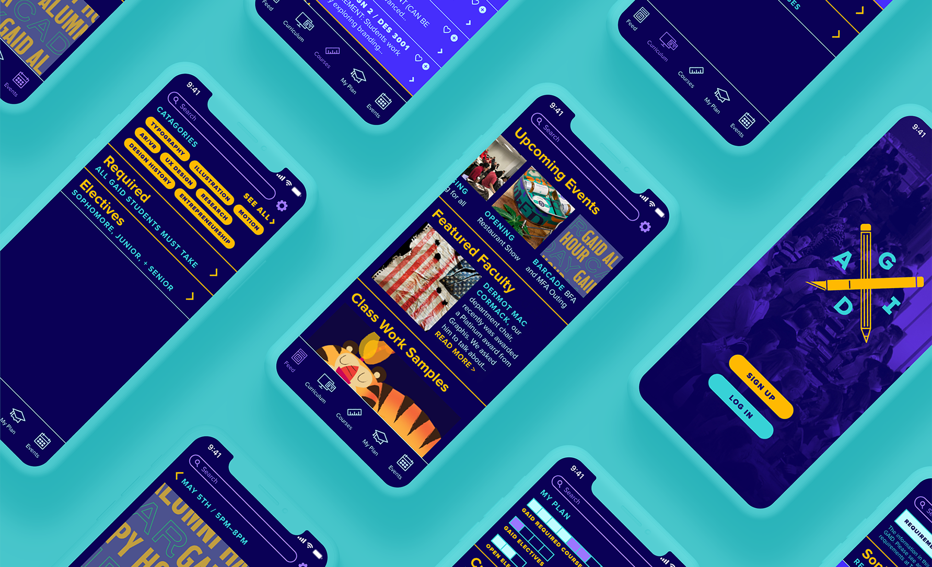
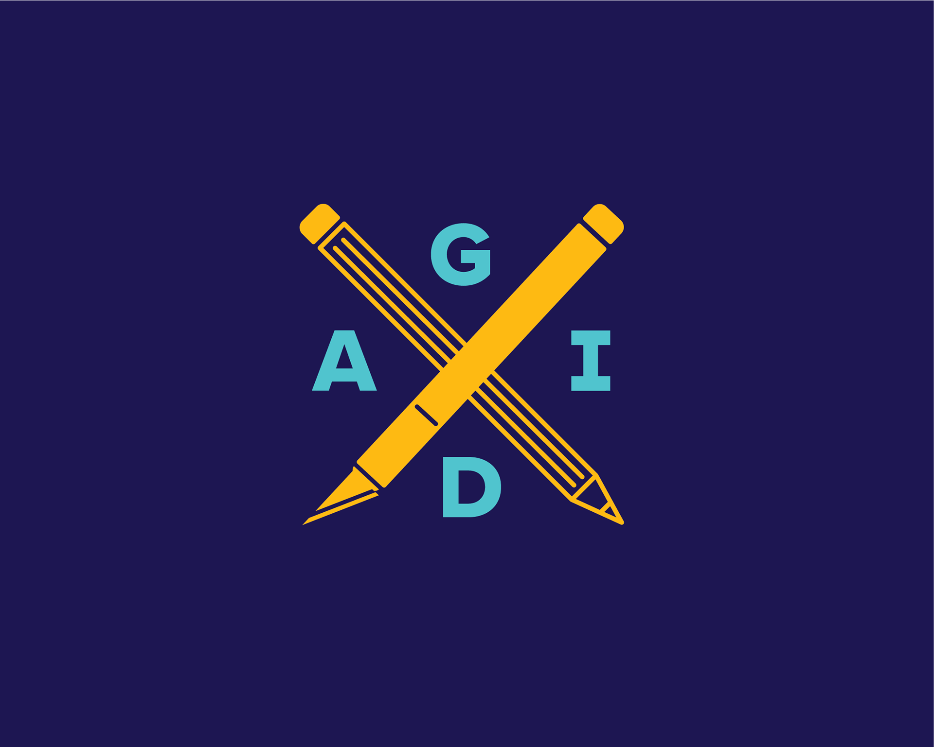
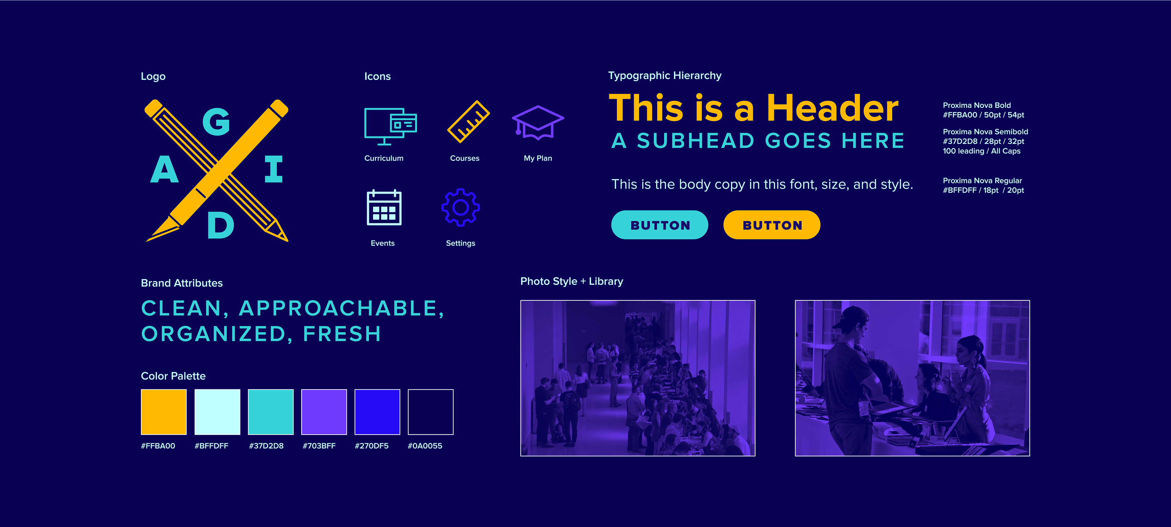
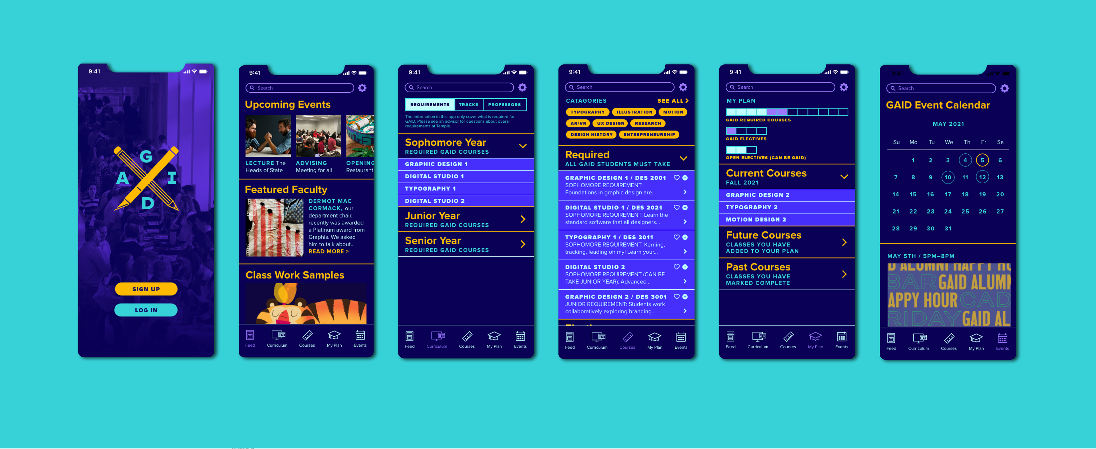
Since the audience for this app is college-age students, I wanted to look and feel to be modern and familiar. The decision to use a dark background was made for this reason. The acronym for our program is GAID so the idea for a logo with crossbars fit perfectly. Taking inspiration from my mood board, I created a style tile to use as a visual guide for skinning my wireframes and a logo.
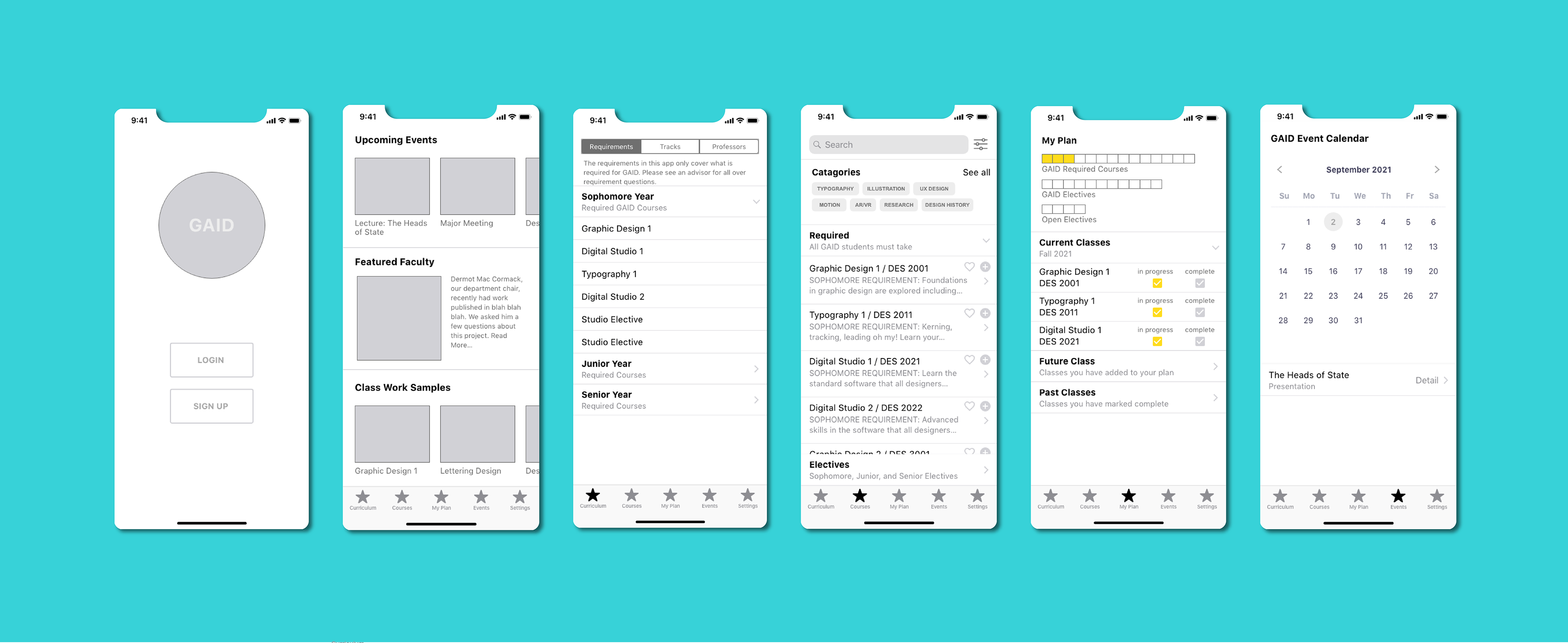
Prototype
As I started to “skin” my wireframe I did find one big flaw I had to address, I have a feed on the first page of my app, but didn’t have any way to get back to the feed. My solution was to add a search bar at the top with the settings button next to it and adding a feed link to my main, bottom navigation. While adding animation I also thought through some of the functionality and made a few changes. For the feed, I changed the structure so only the top section, Upcoming Events, is scrollable. The final video features auto animation from Adobe XD and a mockup from Rotato.